Logitech

01. Project Overview
Logitech Personal Workspace Configurator — turning a five-category catalog into a one-minute guided setup.
Logitech sells hundreds of mice, keyboards, headsets, webcams and lights. Shoppers usually buy them one at a time and rarely know which pieces work well together. I led UX/UI design for a visual configurator that asks up to five plain-language questions and returns a complete desk setup, rendered on an illustrated 3D desk, that shoppers can adjust and add to cart in one click.
The brief was commercial as much as experiential: grow average order value through cross-category bundles while making the store easier to shop for people who don’t speak in specs.
Scope I owned:
• Illustration-led UI system for question cards and the results scene
• Results experience: desk scene, product hotspots, swap drawer, bundle tray and one-click add to cart
• Responsive layouts and design QA through launch
Result:
Shipped and still running in 2026. A typical recommended setup comes to about $790 across five devices, versus about $120 for a single ergonomic mouse, so every completed session ends in a full cross-category cart. Live on logitech.com.

02. Roles, Tools, Duration
Role
Lead UX/UI Designer. Owned flow architecture, question design, visual system, results interactions and design QA.
Team
Product manager, 3D illustrator, two front-end engineers, a recommendation-logic analyst, and me
Tools & Technologies
Figma for flows and UI, Illustrator and Cinema 4D for the isometric scenes, Maze for unmoderated tests
Duration
14 weeks from kickoff to launch, then two post-launch iteration sprints
03. Challenge and Problem Statement
Shoppers knew how they worked, but the store asked them to shop by spec, one category at a time.
Hybrid work turned the desk setup into a single purchase decision: a mouse, keyboard, headset, webcam and light that need to work together. Logitech’s site was organized for the opposite behavior. Category pages filter by attributes like connectivity, platform, keyboard typing feel, layout size, and mouse size and fit (example below). Those filters assume you already know what you need.
Shoppers knew how they worked, but the store asked them to shop by spec, one category at a time.
Hybrid work turned the desk setup into a single purchase decision: a mouse, keyboard, headset, webcam and light that need to work together. Logitech’s site was organized for the opposite behavior. Category pages filter by attributes like connectivity, platform, keyboard typing feel, layout size, and mouse size and fit (example below). Those filters assume you already know what you need.

The four problems we set out to solve
Spec-first navigation. Shoppers were asked to choose between terms they didn’t understand, such as receiver types or layout sizes.
Single-item journeys. People bought a mouse and left. Nothing on the page helped them build the rest of the desk.
Invisible fit. Ergonomic mice depend on handedness and hand size, which you can’t feel through a screen. In our review mining, size and handedness were the most common complaints about ergonomic mice.
Choice overload. A broad catalog with near-identical models made comparing feel like homework.
Problem statement
How might we help a shopper who knows how they work, but not what they need, build a compatible, full desk setup in about a minute, without reading a spec sheet?
Business framing: Logitech needed to raise average order value and cross-category attach rate, while keeping the experience fast enough not to slow down shoppers who were ready to buy.

04. Goals
We agreed on goals for the shopper, the business and the design system before any screens were drawn, so every later trade-off had a tiebreaker.
Type | Goal | How we measured it |
|---|---|---|
Shopper | Get a complete setup in about a minute | Median time to results, target under 60 seconds |
Shopper | Answer every question from self-knowledge, with no spec jargon | Question-level drop-off; usability task success |
Shopper | Change any item without starting over | Swap-drawer use; restarts per session |
Business | Grow order value through bundles | Configurator order value vs. site average |
Business | Lift cross-category attach | Items per cart from configurator sessions |
Business | Cut fit-related returns on ergonomic mice | Return rate for configurator-sourced ergonomic orders |
Design | Five questions maximum on any path | Flow audit |
Design | One reusable question template for new categories and locales | Templates reused without new layouts |
Guardrail: the configurator could not slow down shoppers who already knew what they wanted. It lives as an optional path, and the bundle stays editable down to a single item.
05. Research and Analysis
The core research job was translation: turn a spec-driven catalog into questions a person can answer about themselves.
Discovery ran over the first four weeks, in parallel with merchandising's catalog audit.
Methods
Stakeholder interviews with eCommerce, merchandising and product marketing (8 sessions) to learn the business rules: which SKUs can bundle, which are hero products, and which pairings break compatibility.
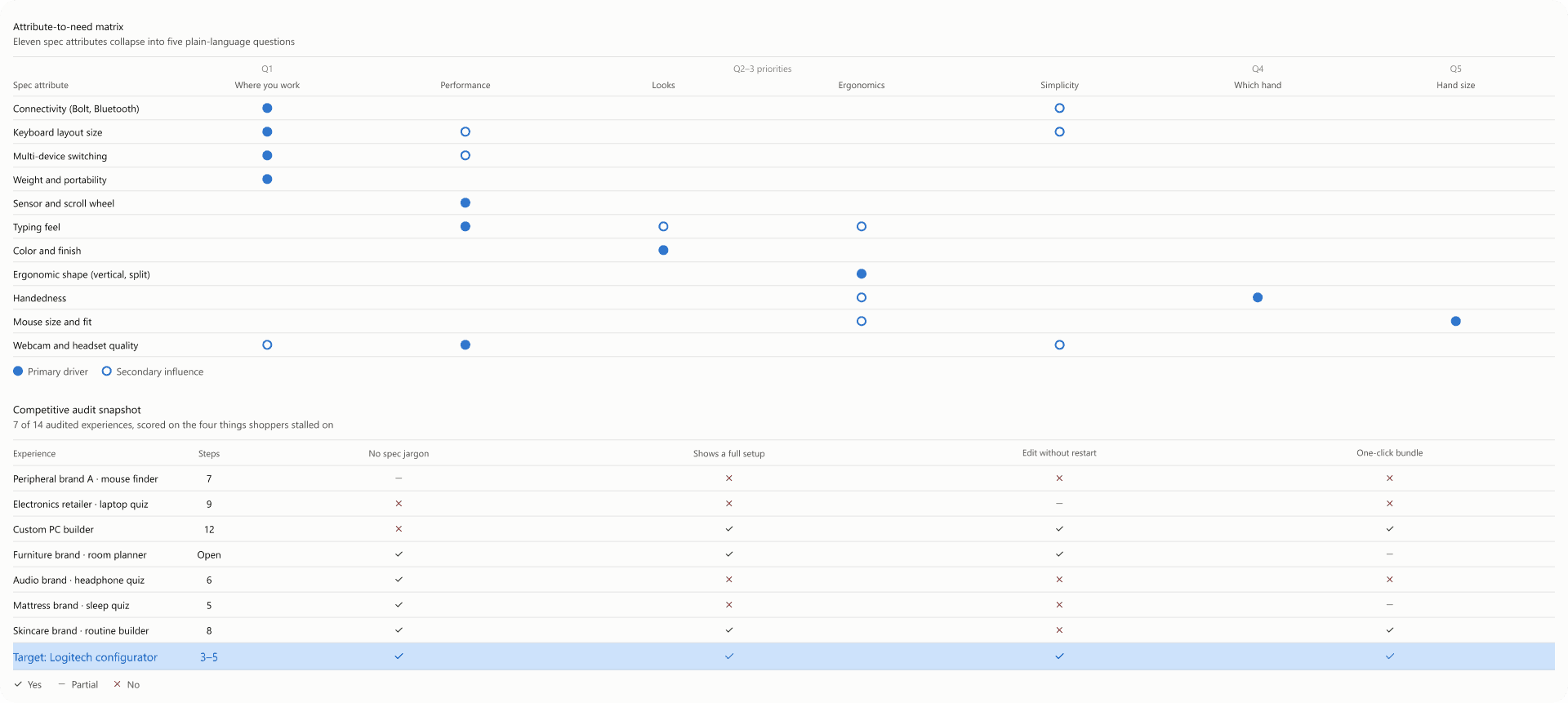
Competitive and analog audit of 14 guided-selling quizzes, build-your-own configurators and room planners. I scored each on question count, jargon, how results were shown, and whether you could edit them.
Analytics review of mouse, keyboard and combo category pages: filter usage, exits from comparison, and how often carts held a single item.
Review and support mining: about 600 product reviews and support tickets for mice and keyboards, coded into themes like wrong size, wrong hand and incompatible.
Attribute-to-need mapping: every product attribute rewritten as a human need, then grouped into the smallest set of questions that could separate the catalog.
Initial insights
Shoppers describe where and how they work, not what they own.
Almost nobody could say their hand size, but everyone could compare it to an everyday object.
Quizzes in the audit lost people when results looked like a product listing page. The reward felt like more homework.
Merchandising needed control over which product won each slot, so the logic had to be editable without redesigning screens.
06. Persona
Three personas, defined by where they work rather than demographics, became the three answers to the configurator’s first question.


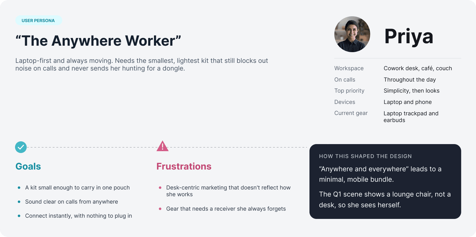
Cross-cutting modifier — the comfort-first shopper. Any persona can choose Ergonomics as a priority. That one choice unlocks the handedness and hand-size questions, so fit is only asked of people who care about it.
07. Findings
Six findings shaped the product. Each one maps to a specific decision you can see in the shipped flow.
# | Finding | Implication | What we built |
|---|---|---|---|
1 | People describe their work, not their gear | Questions must be about context, never specs | First question asks where you work, with three illustrated scenes |
2 | One priority doesn't separate the catalog; people trade off | Capture a ranked second priority | Second-priority screen hides the first pick and can be skipped |
3 | Fit drives ergonomic dissatisfaction, and nobody knows their hand size | Use an everyday reference; ask only when fit matters | Handedness and hand-size questions appear only on the Ergonomics path; size is measured in credit-card widths |
4 | Shoppers want to see the setup together, not a list | Results must look like a desk, not a listing page | Recommended products render in place on a 3D desk scene |
5 | Trust in a recommendation depends on control | Every item must be swappable or removable without restarting | Hotspots open a category drawer with alternatives; tray cards can be removed; total updates live |
6 | In the audit, quizzes longer than five or six steps lost people before results | Cap the path and branch instead of adding questions | Three questions on most paths, five at most |
08. Wireframes
I explored three structures in low fidelity before committing to a short guided quiz that ends on an editable, pre-built desk. Each concept was a clickable grayscale prototype, reviewed with the PM and merchandising before any illustration work began.

Three interaction structures made the trade-off visible: a product grid leaves comparison work to the shopper; an empty desk requires every choice upfront; an editable recommendation provides a complete starting point.
One question, one reusable structure:
The question template keeps earlier answers visible above a single prompt. Each answer combines a visual cue with short, plain-language copy, so shoppers can respond from their own experience rather than product specifications. Back and Start over remain available throughout the flow.

A consistent template keeps prior answers visible, asks one question at a time, pairs visual cues with plain language, and preserves a way back.
Flow and branching:
The flow moves from work context and priorities to mouse fit, then presents a complete recommended setup. The second priority is optional: shoppers can choose a remaining priority or continue without one. Both routes rejoin the same fit sequence.
At results, shoppers can keep the recommendation, explore category alternatives, or remove an item. Replacing or removing a product updates the selection and total, returning shoppers to review without restarting the questionnaire.

A guided sequence moves from shopper needs to an editable setup. Category swaps and item removal return shoppers to the updated selection without restarting.
Start complete; change what matters:
The results screen presents the recommendation as a workspace rather than another product listing. Product hotspots connect the desk scene to category-level alternatives. Opening a category drawer keeps the broader setup in view while the shopper considers a replacement.
The selection tray brings chosen products, removal controls, total, and Add to cart together. It separates two tasks: exploring alternatives in the scene and committing to the current selection. The result is a useful recommendation that still feels editable.

The desk scene provides the overview, the category drawer supports focused changes, and the selection tray keeps the current bundle and purchase action together.

A responsive interpretation preserves the decision hierarchy through stacked choices, a focused category sheet, and a compact purchase summary.
09. Hi-Fi / Interface Design
The final interface makes a recommendation engine feel like a friendly conversation that ends on a finished desk.
Visual language:
Soft-gray isometric 3D vignettes on floating plinths, all from one camera angle, so every answer card reads as part of a set.
Logitech teal and purple used only as accents, so the products in the results scene stay the hero.
Each answer card pairs an illustration, a short label and a first-person line ("I've got a fixed desk…") so shoppers recognize themselves instead of decoding a category.

Voice
Copy is conversational on purpose. Questions sound like a store associate talking, and the hand-size question openly admits it's an odd thing to ask. That tone buys patience for the more personal questions on the ergonomic path.
Question screens:
One question per screen with two to four large cards; tapping a card advances. No separate submit step.
Earlier answers stack as chips above the question, so shoppers always see how the setup is being built.
A fixed footer with Back and Start Over makes it safe to explore.
The second-priority screen removes the first pick and can be skipped with Continue.
The hand-size question mirrors the hand chosen ("your right hand") and measures in credit-card widths: Small, Medium, Large.


Results: "Your Ultimate Setup"
The recommended products render in place on the desk scene, so shoppers see a setup, not a list.
A hotspot on each device opens a category drawer: the recommended pick on top with key specs, an in-bundle state and a Compare checkbox, then ranked alternatives below.
A bottom tray lists the selection with remove buttons, a live total, and one Add to Cart for the whole bundle.
Answers and chosen SKUs live in the URL, so results survive refresh and the back button, and a setup can be shared. The bundle recomputes after each answer.
Accessibility and responsive. Every answer card is a real button with a visible focus ring and a text label, so the illustration is never the only cue. Illustrations carry descriptive alt text, and all text meets WCAG AA contrast on the gray background. On mobile I specified stacked cards, a tray that collapses to a summary bar with the total, and the category drawer as a bottom sheet.

10. Research and Validation
We validated the flow in rounds, before and after launch, and the measures traced straight back to the goals in section 4.
Validation ran in two rounds before launch and continued through analytics after launch.
Methods:
Moderated usability sessions: two rounds of 6 participants, recruited from people who had bought a mouse or keyboard online in the past year and worked hybrid or remote. Tasks: build a setup for your own desk; swap the recommended mouse; remove one item and check the total.
Unmoderated first-click and preference tests in Maze with 40 participants, to check that the illustrations and first-person lines were understood without reading the labels.
Results-layout comparison: the desk scene against a plain product list, tested in round 2.
Post-launch analytics on the funnel: start, each question, results, add to cart.
What we learned and changed:
Test | What we saw | What we changed |
|---|---|---|
Round 1 | People hesitated on the second-priority screen when their first pick was still listed, and some wanted to skip it | Removed the first pick from the options and added Continue to skip |
Round 1 | Most participants couldn't size their hand in inches or glove sizes | Switched to credit-card widths with a drawn reference |
Round 2 | With a product list, people scanned prices and ignored the setup; with the desk scene, they explored and swapped | Kept the desk scene, added hotspots on each device and a persistent tray with the total |
Post-launch | Shoppers opened the swap drawer but rarely used Compare | Proposed a one-line "why this pick" rationale (see Reflection) |
What post-launch analytics tracked:
drop-off at each question, results-to-cart rate, swap-drawer use and bundle size, reviewed with Logitech eCommerce each sprint.
The funnel numbers belong to Logitech, so I don't publish them here. I'm happy to walk through the trends and what we changed because of them.
11. Conclusion / Reflection
The configurator turned a spec-driven catalog into a three-to-five-question conversation that ends in an editable, one-click bundle, and it is still live on logitech.com.
Outcomes:
Shipped and still live on logitech.com in 2026.
Three questions on the default path, five at most on the ergonomic path, with no spec terms anywhere.
Every completed session ends in a full cross-category cart; a typical setup is five devices at about $790.
One question template carried all five questions, so adding a category means new content, not new screens.
What worked:
Asking about the person, not the product. No question uses a spec term.
Branching instead of lengthening. Fit questions appear only for comfort-first shoppers.
Showing the answer as a desk. The result feels like a finished setup, not another listing page.
What I'd do differently:
Show the why. The drawer labels a pick as Recommended but doesn't say which answer drove it. A one-line rationale ("Picked for your medium right hand") would build more trust and cut comparison time.
Design the logic as a product. The rule matrix with merchandising was as important as any screen. Next time I'd make it a shared, versioned artifact from week one.
Budget for illustration. A custom 3D scene for every answer looks great but slows new categories and locales. I'd build a modular scene kit earlier.

